

North Shore Magazine For Lawless
- Feb 19, 2023
- 1 min read
Our project Neutrals on Neutrals was featured in North Shore Magazine this month and we couldn't be more thrilled and grateful.
Like in all of our projects, we wanted to capture the our client's vision while mixing it with unexpected choices to elevate the space.
One of our favorite things about this project was working getting the opportunity to work with the same client again. It's a testament to our team's dedication and care with clients when they return.
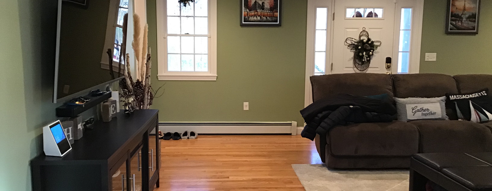
In a time, where, bright, light and airy is highly requested; we took on the challenge of keeping it Neutral on Neutral but far from one dimensional and boring.

Oravec took cues from the geography for both homes. While foundations are neutral, the palette on the Cape skews cool with watery blues. Here, the neutral base is warmer and the accents richer, with touches of black for contrast. Greenery plays an important role, too. “We live in the woods with nature all around us,” Phan says. “It’s very soothing; I wanted to bring that feeling of well-being in.”
Head on over to Northshore Magazine to see the completed project.
Check out a few before pictures below:


A huge thank you to the team that worked alongside Lawless and to our clients for their trust.
Did you do a double take?
- Raph
Comments