

LD Cape Home Design Bathroom Updates!
Okay so last blog post I left you all in a little bit of a faux. I fully intended to do a blog post the following week updating you all on the actual design, showing you floor plans and 3d models of the space. But projects take priority, I seemingly haven't had time to get in the mindset and sit down to write a blog post.
While I'm writing this, it's a Sunday morning, I have a green tea in hand, and am listening to Taylor Swift's new album, Folklore on repeat. (Which I do have to add is increadible and is my favorite album -- to date, that is.)
So now that I got that off my chest, let's get down to business. I am so incredibly excited about our bathroom and am so excited for it to be done! Mike is doing such an amazing job on renovating it.

Let's recap
Last blog post I shared the details of where I sourced our finishes and materials from. I broke down the details of the items and the why behind them. We dove into inspiration for the space, and the goals we wanted to accomplish.
When we started the renovation, we had fully intended on keeping the plumbing where it was for cost and simplicity. But Mike realized that he was going to have to replace everything, so we switched things up.
We opted for moving our shower towards the window to allow for a foot and a half longer shower! That switch enabled us to have a bench seat with a niche cut out for extra shower storage. With that, we have the toilet and vanity on opposite sides. On the vanity side, we had enough space to add in a little custom shelving unit, too. This was a must for me because before, we were storing our towels in the hallway closet. Which is fine, except when you get out of the shower and forgot to grab a towel beforehand, and then you have to run into the cold hallway dragging water everywhere.
So, do you guys want to see the design?!
I figured I would do this renovation as more of a design process, rather than just showing the final product. I do this with my projects, so why not do this with our own renovation? I think it's also important to show the realistic side of a renovation project. Not everything goes to plan, and it's okay to change and navigate while in the process.
Let me start with the initial layout. I should also preface this with saying that I used the Canvas scanner to get all the dimensions of our home. I use this tool with my client's projects and it saves so much time!

As you can see, there isn't a lot for storage, and a lot of wasted space in the corners of the bathroom.
So, we ended up flipping the space around to end up with this layout!

At first, I was so excited about drywalling the shower. Then, I got nervous and felt like I screwed up. And then once Mike started building the walls, I knew it was a good call. Since the window is right where the glass door is, it actually allows for a lot of light in the space. The tiles are all very light in the shower, so it will help reflect the light in the space.
To make the bathroom feel even bigger, we raised the ceiling quite a bit. That is why there are going to be exposed beams in the space now! I think it gives the bathroom a lot of character and adds to the 1870's feel.

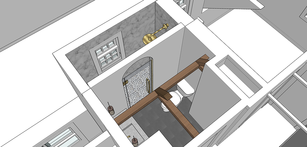

We may or may not do the shiplap on the vanity wall. That is something that I'm not sure about! Another thing I'm not sure about is the marble layout in the shower. That's why I have it just as marble and not a pattern. I have two ideas, and I think I'm going to do a little poll to see what people think will look best. One is very safe, and the other is different and could look amazing, or look off and tired in a couple of years. So, it's just all about the risk level and if I want to try something unique! (Which I'm leaning towards).
That's what's fun about designing your home as an interior designer. Taking risks. It's fun to try out things on your own home before doing them to client's home!
I'm all about doing something timeless, but I also want my designs to be unique and look the exact same. It's fun coming up with interesting designs that speak to your home's integrity and your personal style.
Stay tuned for more updates soon!
Let me know what you think of the design!
xx
-Han
https://soicaulodechuan.net/ mình mới ghé qua thử cho biết thôi, kiểu mở lên lướt vài phút xem giao diện ra sao. Ấn tượng đầu tiên là họ chia nội dung theo từng khối nhìn khá rõ ràng, nên mình kéo xuống nhanh mà vẫn không bị rối hay phải căng mắt tìm. Mình cũng thích cái cảm giác mọi thứ xếp theo cột gọn gàng, nhìn một cái là biết phần nào đang nói về gì. Menu thì đặt ngay chỗ dễ thấy nên đổi qua lại mấy mục cũng tiện, không phải mò. Mà màu nền với chữ nhìn dịu, không bị chói quá nên đọc đỡ mệt. Nói chung dùng kiểu “lướt cho vui” mà vẫn nắm được ý…
iwin mình thấy dạo này hay được nhắc nên cũng bấm vào coi thử cho biết thôi. Mình không có ngồi đọc kỹ hay làm gì nhiều, chủ yếu lướt qua xem giao diện họ làm ra sao. Cảm giác đầu tiên là trang nhìn khá nhẹ mắt, bố cục thoáng chứ không nhồi chữ, nên kéo xuống không bị ngợp. Mấy phần thông tin được chia thành từng khối riêng, nhìn phát là biết cái nào thuộc mục nào, đỡ phải mò. Mình cũng thích cái menu đặt khá dễ thấy, bấm qua lại giữa các mục không bị lạc vì tiêu đề và khung nội dung tách khu vực rõ ràng. Nói chung chỉ xem nhanh như mình…
<p>Mình đọc trên điện thoại và thấy cách xuống đoạn khá hợp lý, không bị mỏi mắt. Cách trình bày này giúp tiết kiệm khá nhiều thời gian khi muốn xem nhanh. Khi cần xem thêm dữ liệu bóng đá, mình thường mở KQBD để đối chiếu rồi quay lại đọc các phân tích liên quan.</p>
UY88 mình cũng kiểu nghe người ta nhắc nên bấm vào xem thử cho biết thôi. Không có ngồi đọc hết nội dung đâu, chủ yếu lướt giao diện với cách họ chia phần. Thấy trang làm khá dễ theo dõi, mấy tiêu đề đặt thẳng thắn nên nhìn cái là đoán được chủ đề đang nói gì. Có đoạn giới thiệu về Études viết ngắn gọn, nói họ kết hợp sáng tạo với chức năng trong kiến trúc nên mình đọc lướt vẫn nắm ý. Mình thích kiểu cuộn xuống là từng khối nội dung tách riêng, không bị nhồi chữ, nhìn đỡ mệt mắt. Phần điều hướng cũng ổn, chuyển qua lại không bị rối, nhất là heading “Cam…
Khi đọc các bài giới thiệu nền tảng giải trí, tôi thường thích những bài viết ngắn gọn để có thể xem nhanh trên điện thoại. Bài viết này có bố cục khá dễ theo dõi khi phần nhắc đến https://tn88vn.co/ được đặt ở giữa nội dung. Điều đó giúp mạch bài trở nên tự nhiên hơn và không tạo cảm giác quảng cáo quá sớm. Nội dung tập trung vào trải nghiệm chung của người dùng với giao diện dễ sử dụng và nhiều danh mục quen thuộc như slot, game bài hay mini game. Nhìn chung cách diễn đạt khá nhẹ nhàng và dễ hiểu.